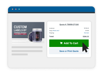
Steps for Designing Optimal Custom Labels
If this is your first time designing label artwork, it can be an exciting but frustrating time if you’re not familiar with graphic design or label printing. That’s why we have created a Beginner’s Guide to help you better understand the basic requirements for submitting usable artwork to us. Please review the guide before submitting artwork.
Use design software.
We prefer the industry standard Adobe Creative Suite because it can manipulate label artwork. Since you are just beginning, you most likely won’t have this program. Professional graphic designers in your area will probably have it. Please have them view our Artwork Specifications before beginning. Artwork made in other desktop publishing programs will need to be individually analyzed (preferably in a PDF format) to see if it’s acceptable.
Choose a label size before you start designing.
Please measure your container to be sure that the label will fit. The size that fits the face of the container will be the label size you will need to create. Click here to learn how to measure your container.
Format artwork in CMYK.
Artwork that is submitted in RGB may be returned back to you so it can be converted to CMYK because we only print in CMYK and Pantone spot colors. Learn more about CMYK, RGB and spot colors here.
Use high-res images.
Your artwork should have a minimum resolution of 300 DPI (dots per inch) for quality printing. We prefer images not to be less than 300 DPI because the printing quality becomes poor. You can purchase high-res photos from a stock photography company. Click here for more information on high and low-res images.
Make layered artwork.
Layered art is much easier for our Art Department to work with because its elements (graphics, colors, effects, lines, etc.) can be moved, edited or changed. Images, like a photo, are considered flat art because its elements are fixed and can’t be easily manipulated like layered art. Below are some tips on graphics that can improve your label artwork:
- Vector graphics: We recommend that you design with vector graphics instead of raster graphics because of their versatility and quality. For more information on vector and raster graphics, click here.
- Artwork Tip: One way you can identify a vector image is if you can zoom 600-800% into the image without the graphics and text becoming pixelated or blurry. Common file extensions for vector graphics: .ai, .pdf, .eps and some “clipart” is vector.
Convert text to outlines.
To ensure your text appears correctly, you should convert your text to outlines so “missing” font errors or font substitutions don’t occur. Adobe Illustrator and other design software will recognize the converted text as an object so it will print the text as it originally appears. Click here to learn how to convert text to outlines.