Striking it On Your Own
Working with an experienced label designer is the best way to ensure your label artwork is ready for high quality label printing. However, we understand that hiring a professional designer may not be possible for some customers who have tight budgets or want to design a simple label on their own. Either way, our list of best practices for designing custom labels will help you get started in the right direction. Below are some points of consideration to better ensure your label artwork is suitable for printing.
Before You Start Designing…
Save yourself some time and headaches by using the appropriate software to design your label. Adobe Illustrator is the preferred method for designing custom labels because it can create high-quality vector artwork that will ensure good print quality on flexographic or digital label presses. Illustrator is better for label design than Microsoft Office and Paint because it can work with layers and vector (i.e. wireframe) elements. Artwork that is “layered” means that individual design elements can be changed, moved or edited. Our Artwork FAQ section is a great place to learn more about software compatibility.
Our Best Practices of Designing Custom Labels
Here are some of our most popularly given tips compiled by our art and customer service teams. We also have a downloadable art specs sheet you or the label designer can use for a more detailed reference.
Setting Up the Label Template
- Measure your container. It’s important that you measure your container before you start working on the design so you can have the right label size. Not working with the label size or shape that’s suitable for your container can create challenges later on with the design’s layout because it will need to be resized or reformatted to fit your label specs. If you’re labeling a container with a taper or small diameter, there are important considerations for designing the label artwork and selecting materials.
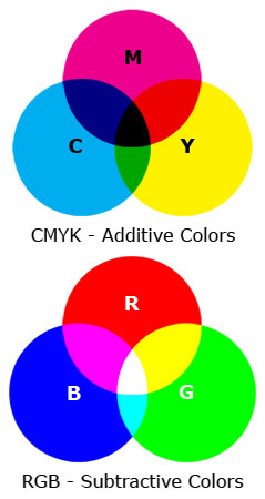
- Design in CMYK colors – not RGB. Label printing uses a four color process – also known as CMYK (cyan, magenta, yellow and ‘key’ black) – with the option of printing Pantone spot colors. RGB (red, green and blue) is used for web/video applications because they’re the colors used for electronic screens. Don’t create your label in the RGB color space as the color will shift when converting it to CMYK. Check out our article on CMYK, RGB and spot colors for more information.
- Line up artwork with a guide/ruler. Design software has tools you can use to make sure your artwork is lined up properly. Rulers and guides can create a line graph so you don’t have to guess whether the graphics, texts and images are evenly spaced or straight. Find out how to setup a document so you can rest assured that you’re starting your design on the right path.
- Put at least a 0.0625″ (1/16 in.) bleed on all sides of the label. A ‘bleed’ is when the artwork extends beyond the edge of where your label will be cut (aka die cut) so that there are no white spaces around the label’s borders. Our quick guide can show you how to create a bleed in your design software.
Designing the Label Artwork
- Use high-resolution images. Images on the Internet tend to have low resolutions so it’s essential that you use find high-res images of at least 300 DPI (dots per inch) so the labels don’t look blurry when printed. Please note that PNG and GIF files can’t be used for high-quality printing. Click here to see an example of what we mean by high and low-res images.
- Choose vector graphics over raster. Vector and raster are two types of graphics and are used for different purposes. Vector graphics are preferred for printing text on labels because they can be enlarged or reduced without losing image quality or becoming pixelated (like raster). See what other differences exist between vector and raster graphics so the design process won’t be unnecessarily delayed because of poor quality graphics.
- Place logo where it’s most prominent. Having a logo that is too small or obscured by other artwork can hinder the label design and make your brand unnoticeable. Good places to put your logo are at the top or center of the label design where customers are most likely to see it.
- Convert text into outlines. Converting your text to outlines is important because it will make design software recognize the text as an object instead of a font. By doing this, it ensures that no “missing” font errors or font substitutions occur when our art department opens your files in Adobe Illustrator. Learn how to convert fonts to outlines in our step-by-step guide.
Following Label Regulations
- Follow applicable labeling regulations. Certain products are regulated more than others so it’s important to see what labeling regulations are applicable to your product. For instance, food labels are regulated by the Food and Drug Administration and often require a nutrition fact table to be on the principal display panel for consumers to easily see it.
- Incorporate a barcode for retail or internal communications. A UPC barcode is a great way to instantly communicate a product’s information in a store’s point-of-sale system or internally between departments. There are, however, certain design restrictions to UPC barcodes such as the size (minimum 1” width from left to right bar) and colors. Black or a single dark color is best for scannability whereas red and white colored barcodes won’t be read by the scanner. If you know your label won’t need a barcode, you can skip this step.
Now that you have a more basic understanding of custom label design, you should be better able to create one that will print well and look of high quality. Our Pre-Press Artist and art team will make sure your label design is good to go before it’s sent to print, but it’ll save you time (and potential fees for multiple revisions) to review your artwork carefully before submitting it through our Art Upload Tool. A valuable resource we have is our tips for submitting artwork which you can review before submitting artwork on our website or to the customer service rep. If you’re still unclear about proper label design, check out our guides and label articles for artwork support.
Editor’s Note: This post was originally published in September 2013 and has been updated for accuracy and comprehensiveness.