While many are wondering what a Trump presidency means to the decor at The White House (among other things), we’ve been more concerned with design choices in the custom label industry. Will the Trump aesthetic sweep the nation? Let’s take a look at what that would mean for brands.
The design language of anything that bears the name Trump is bold, brash, and in-your-face.
BOLD, BRASH, AND ALL-CAPS
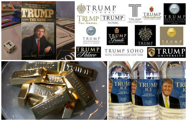
Whenever you see the name Trump on the screen, in an ad, on the side of his plane, or on one of his products it is always all-caps: TRUMP
In that same way, if there is an actual name after TRUMP, it is also bold, brash, and wealthy sounding. EMPIRE, GRANDE, PALACE, etc.
Do your labels GRAB people the same way?
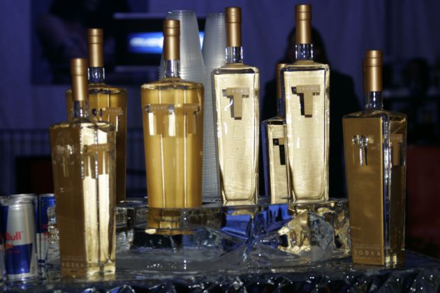
THIS MUST BE GOOD, IT’S GOLD!
The Trump brand strives to convey an image of wealth and sophistication. The labels are supposed to do the same thing. Lots of gold metallic and classic fonts to go along with the bold lettering are an effort to get people to think everything with the name Trump on it is better than anything else.
It’s a TREMENDOUS strategy if you can pull it off.
Fonts Don’t Matter Much
The Trump brands don’t think much about font consistency. Most of these products are from different manufacturers and it looks like there wasn’t much communication about brand consistency from any of them. The fonts and colors are all over the place, but they still maintain that BOLD and brash concept, with copious amounts of gold giving them all the “wealthy” look.
As long as you believe your brand is Big League, it will be, right?
Obviously, we can’t promise that you’ll sell any more products using the Trump design style, but we’re sure you’ll catch some eyes! Check out more design options and create your own trends in the coming year in our gallery and blog.