Warning labels play an important role in our everyday lives; alerting employees to workplace dangers or informing customers on proper use a product. According to a report by Technavio, it’s likely that we’ll be seeing even more warning labels in the near future – they predict the global warning labels and stickers market will surpass revenues of $10 billion by 2020. The thing about warning labels, however, is they’re only truly effective if they get noticed (and people actually heed the warning, but that’s another story). There are some surefire ways to ensure your labels attract your target audience’s attention, using bright colors, attention-grabbing graphics, unique materials, and more. Let’s get started!
Labeling Tips for Custom Warning Labels
To create warning labels that work, you have to take into account your audience, message, design, and label’s environment. Don’t worry, it’s not as hard as it sounds. With a little planning and some discussion with your safety manager, label designer, and printing company (aka us), it’ll be easier to determine the best plan of action. In the meantime though, here are some labeling tips to help you get those conversations started.
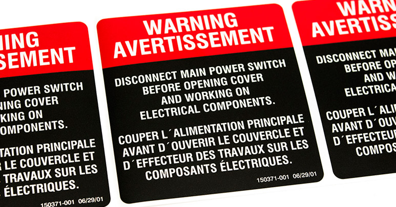
- Go bright and bold: Bright colors are an easy way to make your warning labels stand out. Bright reds, yellows, and oranges are always popular color choices since they’re bold and attract the eye very well. Depending on the environment, one option to consider is fluorescent labels because of their bright, neon quality that makes them “pop” wherever they’re applied. Whatever color or material you choose, keep the design simple, as too many colors on the same label can overwhelm the design and distract people from the main message.
- Graphics are louder than words: Warning labels often use a bold graphic or two that communicates dangers at a glance and clarifies associated hazards. Sometimes employees and customers don’t read the whole label, but they can get a general idea of the dangers through warning graphics. Check out What You Need to Know About GHS Labels (i.e. hazardous chemical labeling) to see common warning graphics used on labels and what they mean.
- Avoid fancy words and long sentences: In other words…keep it simple! Some warning labels are pretty straightforward to begin with, like “Do Not Use” and “Warning: High Voltage,” but for more complex labels that include directions, multiple warnings, medical instructions, and other information, it’s best to use clear and concise writing. Too much jargon or long sentences can be confusing for newer employees or first-time customers, so keep your message as straight to the point as possible.
- Make it easy to read: Readability is important with warning labels because they aren’t much help if people can’t read them quickly and easily. To ensure readability, your warning labels should have: legible text, an organized format, some blank space so the design isn’t cramped, and contrasting text/background colors like black and white to make words easier to read.
- Underline or bold important parts: When you have multiple warnings on a label, you may want to consider underlining or bolding a word or sentence to draw attention to the most important information. For example, bolding or underlining warnings that pertain to immediate injury or worse can emphasize the danger and draw the reader’s attention better than if the warning looked the same as the rest of the text.
- Select the right materials: If you need your warning labels to last for more than a couple months or under harsh conditions, it’s critical that your label materials can stand up to the challenge. Film labels are a good choice as they’re more durable and have better water resistance than paper labels. However, if you’re labels are going on products/items with a short lifespan, we suggest using a cost-effective material like semi-gloss paper. Simply add a laminate finish to increase its durability.
- Bonus tip! Warning labels that will be outside or on equipment should be printed on vinyl or polyester film with lamination because heat and abrasive substances (chemicals, oil, sunlight, dirt, etc.) will deteriorate paper labels.
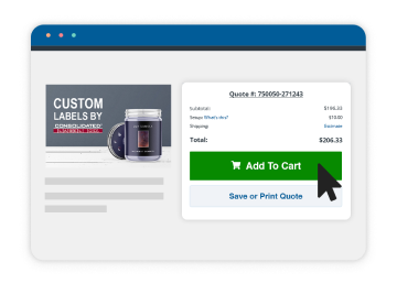
Due to the important nature of warning labels, it’s essential to have a game plan when placing a label order. It doesn’t need to be formal and fancy, but we do recommend having all your label requirements prepared so your customer service rep can make the best recommendations possible. By label requirements, we mean information like the label’s size, shape, artwork, application environment, and the item it will be applied to, for example. If you need help determining your label requirements, our customer service team would be happy to help.